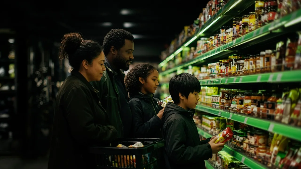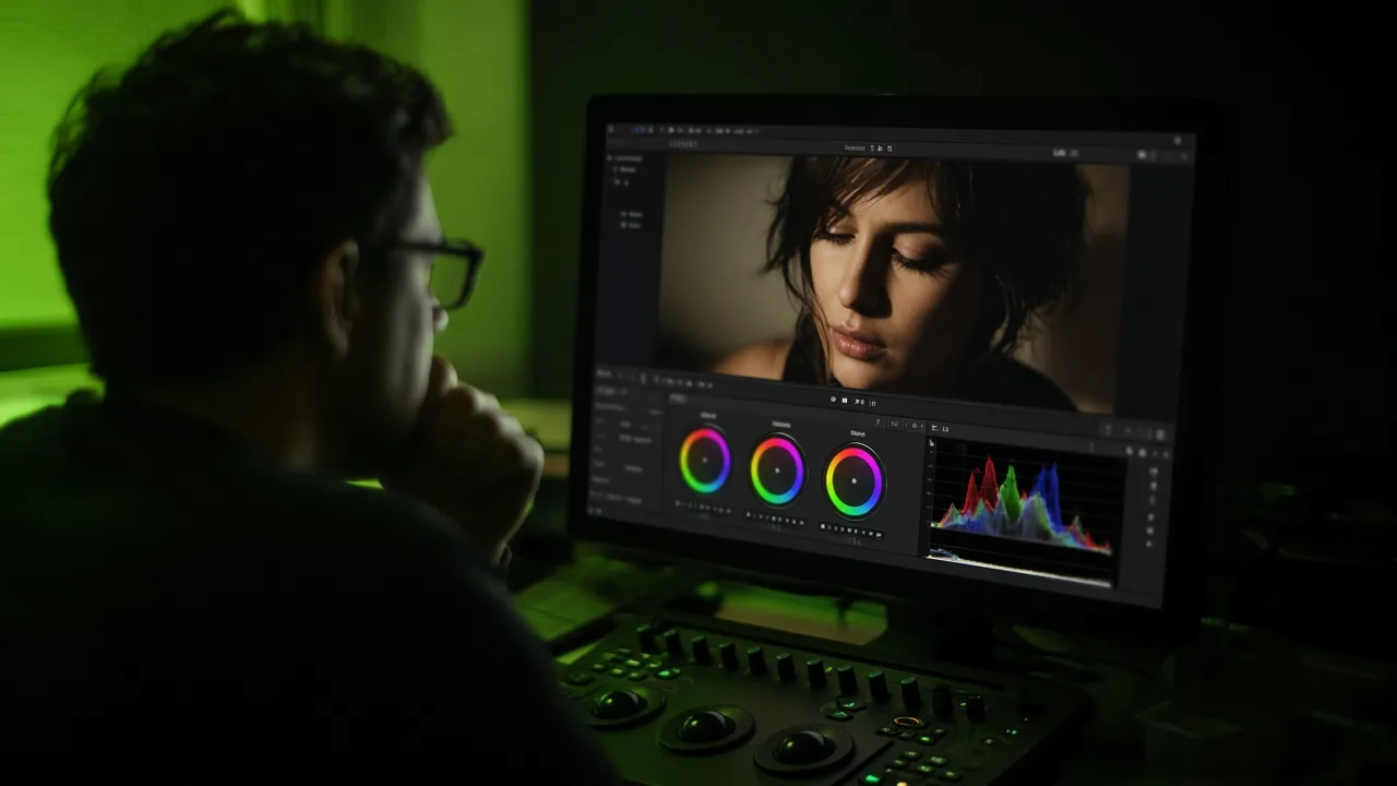
Color grading shapes how skin tones, settings, and mood read on screen — and a grade built around a default 'general market' look can quietly flatten or misrepresent the people and places a multicultural campaign is meant to represent. Treating color as a cultural decision, not just a technical one, is one of the simplest ways to make authentic casting and production actually land.
Color grading tends to happen last in a production timeline, after casting, scripting, and principal photography are locked. That late placement can make it feel like a technical finishing step rather than a creative one — but grading decisions directly shape how a viewer perceives skin tone, warmth, setting, and mood, all of which carry cultural weight.
A grade calibrated for a default lighting and skin-tone profile can wash out or misrepresent the very diversity a campaign set out to capture. Agencies that treat color as part of the creative brief, not an afterthought in the edit bay, consistently produce work that reads as authentic rather than generic with diverse faces inserted into it.
Why Default Grading Profiles Can Undercut Authentic Casting
Many post-production pipelines still default to grading profiles built and tested around a narrower range of skin tones and lighting conditions. Applied without adjustment, those defaults can desaturate warmth, shift undertones, or flatten contrast in ways that don't do justice to a genuinely diverse cast — undermining casting decisions that were made carefully and deliberately.
This isn't a niche technical complaint; it's a continuity-of-intent issue. If a brand invests in authentic casting, real locations, and culturally specific art direction, the color grade is the last checkpoint where all of that intent either survives or gets quietly erased.
- Review color grading with the same cultural lens applied to casting and location scouting — not as a separate technical workstream.
- Test grading choices against a range of skin tones represented in the cast, not a single default reference.
- Involve a colorist early enough to flag lighting or wardrobe choices on set that will be hard to grade well later.
- Watch for over-correction toward a 'universal' look that strips out the specific warmth or saturation of a real location.
- Treat color as part of the creative brief and client approval process, not a step that happens after sign-off.
What Culturally Intentional Grading Looks Like in Practice
The strongest multicultural productions treat color the way they treat music or wardrobe — as a deliberate creative choice tied to the story and the people in it. That might mean grading toward the warmth of a specific region's natural light, or making a conscious decision about how skin tones should read against a particular setting.
It also means giving colorists direction that goes beyond 'make it look cinematic' — direction that names the cultural and emotional tone the footage needs to carry, and checks the result against it before it ships.
“The grade is the last place authenticity can quietly disappear — or the last place it gets protected.”
How Alerta! Builds Color Into the Creative Process, Not Just the Edit
Alerta!'s production process treats color grading as a creative decision made with the same intent as casting, location, and wardrobe — reviewed against the specific people and places in the footage, not a generic default profile.
That approach is part of a broader production philosophy: authenticity has to survive every stage of the pipeline, not just the stages a client typically sees in a storyboard or casting deck.
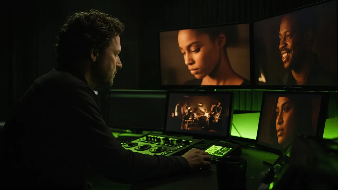
Color grading is where authenticity either survives post-production — or quietly disappears.
Why does color grading matter for cultural authenticity?
Grading directly shapes how skin tones, settings, and mood read on screen. A default profile not calibrated for the cast's range of skin tones can misrepresent the very diversity a campaign is meant to show.
When should a colorist be brought into a multicultural production?
Earlier than the edit bay. Involving a colorist during pre-production or on set helps catch lighting or wardrobe choices that will be hard to grade well later.
Is this an issue with specific equipment, or with process?
It's primarily a process issue. The fix isn't necessarily new equipment — it's treating color as part of the creative brief and approval process, reviewed with the same intent as casting.
Want authenticity to survive every stage of production — including the grade?